Creating Angular Component Styling Hooks with CSS Custom Properties
Published March 28, 2022
When creating Angular components for others to use someone will inevitably request the ability to customize styles that are not supported. While we could add an Input to override a style, this will almost always lead to configuration bloat. A better approach is to provide styling hooks for the CSS properties you wish to make customizable.
What are CSS Custom Properties?
CSS custom properties, also known as CSS variables, are a way to assign a CSS value to an identifier, and then reference that value using the identifiers name.
CSS custom properties are created using the -- prefix:
:root {
  --background-primary: #f7f7f7;
}
CSS custom properties can then be accessed using the var() function.
body {
  background-color: var(--background-primary);
}
The var() function also accepts a default value in cases where the custom property is not defined:
main {
  background-color: var(--background-dark, #333);
}
Defining CSS custom properties using the :root selector will make them available to the entire document. It’s possible to “scope” a CSS custom property to an element as well:
main {
  --background-dark: #333;
  background-color: var(--background-dark);
}
We can leverage the ability to pass default values to the var() function with being able to “scope” CSS custom properties to an element to expose styling hooks for our Angular components.
import { Component } from '@angular/core'

@Component({
  selector: 'my-button',
  styles: [
    `
      button {
        all: unset;
        padding: 1em 1.5em;
        cursor: pointer;

        background: var(--button-bg, #005ea2);        color: var(--button-color, #fff);      }

      button:hover {
        background: var(--button-bg--hover, #1a4480);      }

      button:active {
        background: var(--button-bg--active, #162e51);      }
    `,
  ],
  template: `
    <button><ng-content></ng-content></button>
  `,
})
export class ButtonComponent {}
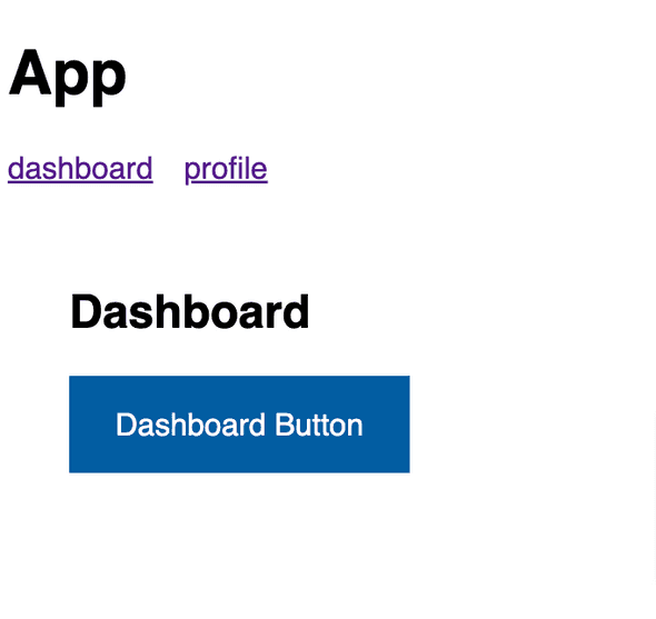
In our ButtonComponent, we use CSS custom properties (--button-bg, --button-bg--hover, and --button-bg--active) to define the background color for the different button states (default, hover, and active). Since we haven’t defined any CSS custom properties yet we pass our default background color values to the var().

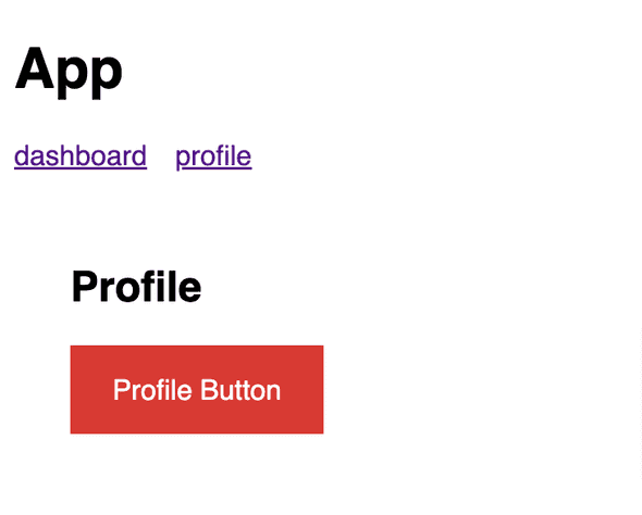
With these style hooks in place, consumers of the my-button component are able to override the background color styles by setting their own values for the CSS custom properties we referenced (--button-bg, --button-bg--hover, and --button-bg--active).
import { Component } from '@angular/core'

@Component({
  selector: 'my-profile',
  styles: [
    `
      my-button {        --button-bg: #d83933;        --button-bg--hover: #b50909;        --button-bg--active: #8b0a03;      }    `,
  ],
  template: `
    <div class="container">
      <h2>Profile</h2>
      <my-button>Profile Button</my-button>
    </div>
  `,
})
export class ProfileComponent {}
We can even leverage the CSS custom property styling hooks internally in our components for creating style variations:
import { Component } from '@angular/core'

@Component({
  selector: 'my-button',
  styles: [
    `
      button {
        all: unset;
        padding: 1em 1.5em;
        cursor: pointer;
        color: #fff;
        background: var(--button-bg, #005ea2);
      }

      button:hover {
        background: var(--button-bg--hover, #1a4480);
      }

      button:active {
        background: var(--button-bg--active, #162e51);
      }

      :host(.success) button {        --button-bg: #3cb878;        --button-bg--hover: #297e52;        --button-bg--active: #16452d;      }    `,
  ],
  template: `
    <button><ng-content></ng-content></button>
  `,
})
export class ButtonComponent {}
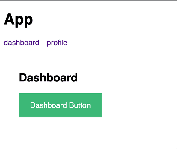
Now consumers of our my-button component can change the style by using the success class:
<my-button class="success">Dashboard Button</my-button>
Or, we can create an abstraction for the class assignment using a theme Input instead. This is my preferred approach since it comes with the added benefit of editor intellisense:
import { Component, Input } from '@angular/core'

@Component({
  selector: 'my-button',
  styles: [
    `
      button {
        all: unset;
        padding: 1em 1.5em;
        cursor: pointer;
        color: #fff;
        background: var(--button-bg, #005ea2);
      }

      button:hover {
        background: var(--button-bg--hover, #1a4480);
      }

      button:active {
        background: var(--button-bg--active, #162e51);
      }

      button.success {        --button-bg: #3cb878;        --button-bg--hover: #297e52;        --button-bg--active: #16452d;      }    `,
  ],
  template: `
    <button [ngClass]="theme">      <ng-content></ng-content>
    </button>
  `,
})
export class ButtonComponent {
  @Input() theme: 'default' | 'success' | 'warn' = 'default'}
Consumers can then pass a theme to get the styles they want:
<my-button theme="success">Themeable Button</my-button>See example on Stackblitz
Conclusion
Providing styling hooks for our Angular components using CSS custom properties allows us to make our components more flexible while still providing default styles.
Joshua Colvin is a UI Software Engineer specializing in building component libraries. He lives with his wife and two kids in Michigan.